More Than a Master Plan
Hillside at Peaselburg Development Microsite
Our design team created a brand identity for the upcoming housing development, to show the surrounding neighbors the bigger picture. However, the Hillside team expected web would be its best way to communicate to potential homeowners. Once a structural wireframe was approved, my responsibility was to bring it to life with the newly created brand elements.
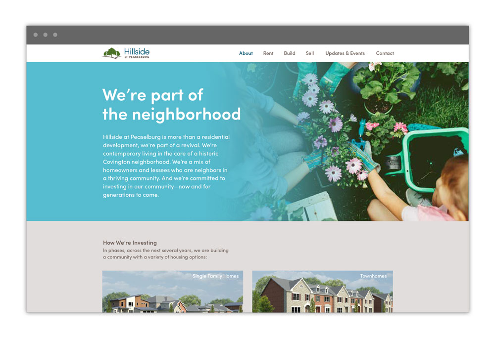
Rather than be a large site requiring heavy navigation, the site is designed in tiers with CTAs like applying for a particular type of home, funneling community events to bring awareness, or providing news about the development progress.
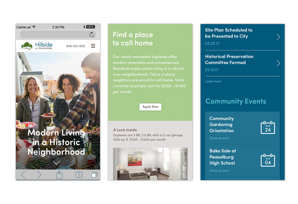
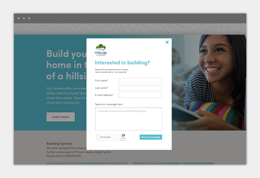
In keeping with the spirit of a microsite, forms are kept brief and on the same page, behaving as a pop-up, and renderings are displayed tiled or in carousels. Final delivery included all comps and a style guide to a developer.
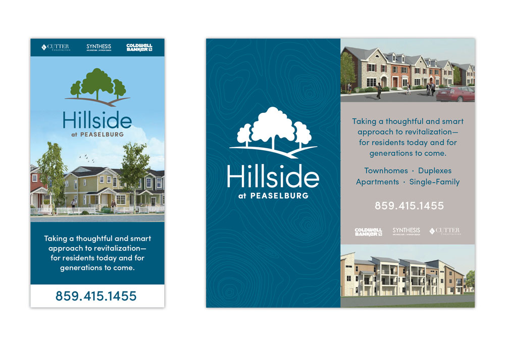
Hillside's other main touchpoint is large wooden signs stationed at diferent entrances of the development site. I designed single, double, and triple-panel concepts that emphasized the vision to come.